
Advertising Campaign
Case Study
Buffalo Trace Distillery
A project creating an advertising campaign combining Buffalo Trace Distillery products with American Revolutionary War era paintings and figures.
Tools
Adobe Photoshop, Generative AI
Project Description
Design Challenge
To design and create an advertising campaign for a company that integrates brand products with well-known paintings. The campaign should demonstrate consistency in tone and message across the campaign as well as showcase photoshop skills in merging the products into existing art pieces.
For this project, Buffalo Trace Distillery is merged with American Revolutionary War era paintings and historical figures.
Background
Buffalo Trace Distillery is located in Frankfort, Kentucky and lays claim to the longest running distillery in the US. Distilling first began on the site in what was then known as Leestown in 1775, 1 year before the United States officially declared independence from Great Britain. The company’s history and longevity through numerous natural disasters is a major point of pride.
Campaign Concept
A clear and concise tagline was needed as a core component of the campaign to tie together the message, time period imagery, and product. Eventually, I settled on “American Made Since 1775.” This quickly communicates the age and longevity of the company, showing a sense of pride in this aspect of the brand, while also making the connection toward the era of history the campaign is centered on. Allowing the tagline to carry through as a consistent message, the next part of the process involved combining time period imagery and the product in a fluid way.
Poster Campaign
Framed Posters
The framed posters utilized era appropriate paintings that also featured well known historical figures and events. One of the challenges in the campaign was using different artists which could have led to a disconnect in visual style. However, I tried to focus on using paintings that harmonized well with one another. The product was integrated into the paintings to show the historical figures enjoying the brand. Ornate frames were added around the paintings appropriate to the time period as well as to organize the ad space. The product was separately blown up into a foreground element to highlight and keep focus on the product.
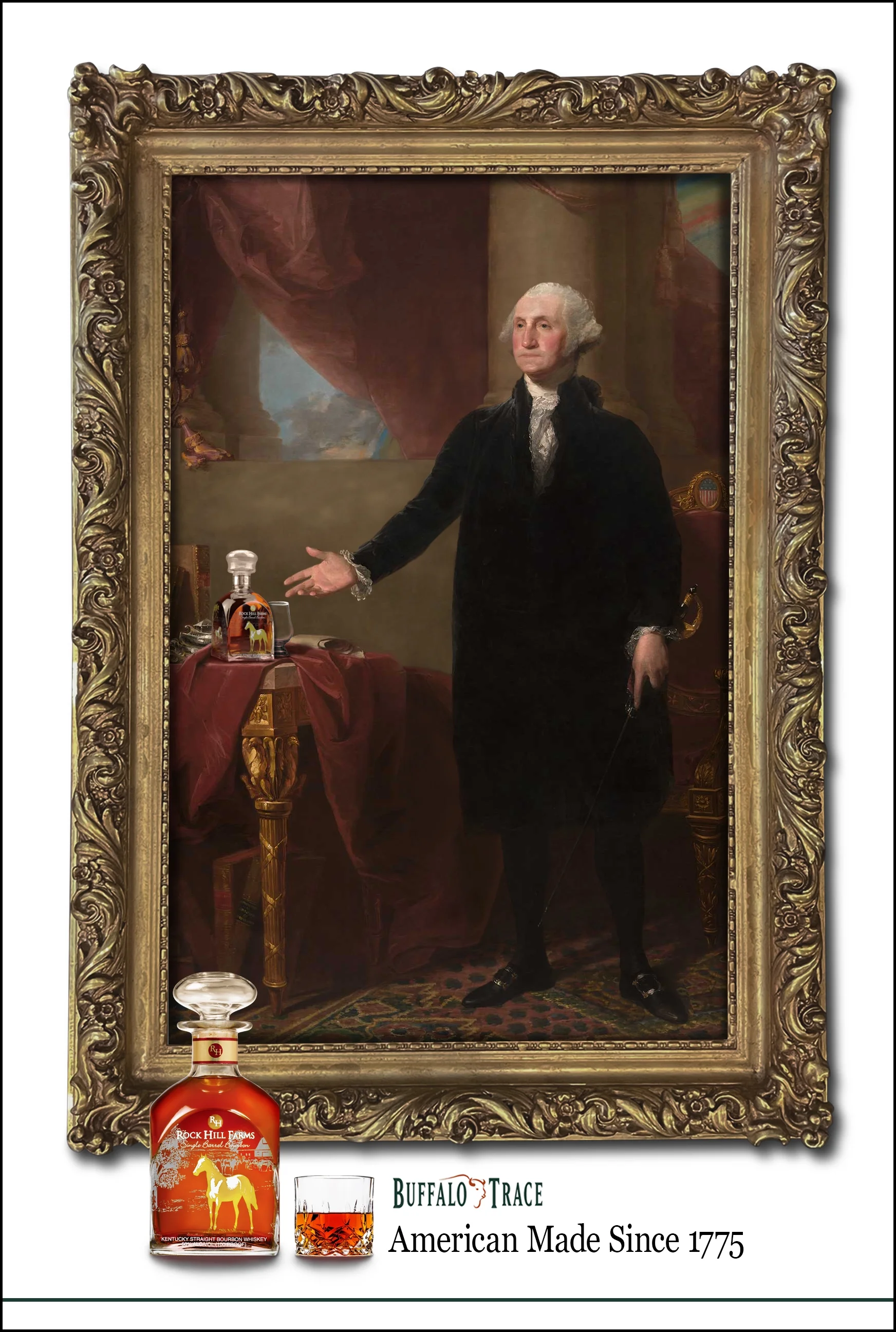
The Lansdowne Portrait x Rock Hill Farms
The Lansdowne Portrait is a life size painting of George Washington. It was painted by Gilbert Stuart in 1796 and is one of the most iconic contemporary images of the president. In this print, Washington is shifted from the original painting and to a stance in which it appears he is offering the product to the viewer. The ad offers a welcoming tone, suggesting that America’s first president is inviting you to enjoy a drink with him.
Image edits include:
adjusting Washington’s arm
shifting Washington to the right
painting in background elements that didn’t exist behind where Washington previously stood
painting in the rug and table cloth where he had stood
painting in new shadows from Washington
removing items for the table and repainting the table cloth to make room for the product
adding the product along with a glass
Buffalo Trace Advertising Poster
Original Painting
George Washington
(The Lansdowne Portrait)
- Gilbert Stuart
The Lansdowne Ad Mockup
The Lansdowne Portrait Design Process
To place the product within the Lansdowne Portrait, several adjustments had to be made to the original painting. The most significant changes were to George Washington whose arm had to be shifted downward to more clearly point to the product as though he were offering it to the viewer. This also required the entirety of Washington to be moved right to make room for the product on the table. Masking and moving Washington across the image required further work which included painting in previously non-existent portions of the background, new shadows from Washington, and new portions of the rug.
Items from the table were removed to ensure the product was prominent. Adjustments to the table cloth helped the bottle fit naturally, and a texture was added to the bottle to help merge it into the texture of the painting. Some color adjustments and highlight/shadows were added to the product and glass, as well.
An ornate frame was added for composition and time period context which included some color and value adjustments as well as inner and external shadows.
Primary Assets
The Birth of the Flag x Buffalo Trace
The Birth of the Flag was painted by Henry Mosler in 1911 and shows Betsy Ross with her assistants sewing the first American flag. While the historical accuracy may be off, the subject is an icon of American new nation legacy. This ad includes women as the focus instead of the male historical figures in the other pieces which attempts to aid inclusivity and marketing toward non-male genders.
Image edits include:
color adjustments
adding the table in the foreground to hold the product
adding the product and the glass to the table
adding relevant shadows
adding a glass to the hand of the woman on the left
Buffalo Trace Advertising Poster
The Birth of the Flag
- Henry Mosler
Original Painting
The Birth of the Flag Mockup
The Birth of the Flag Design Process
For The Birth of the Flag advertisement, some saturation and level adjustments were made to bring the painting closer to the tone and style of the other paintings in the poster series. An ornate frame was added around the painting, in line with the other posters in the campaign.
The original painting lacked a prominent place for the product to be featured, so a wooden table was added in the front to hold and display the bottle. Color adjustments, textures, object shadows/highlights, and environmental shadows were added to seamlessly place the table into the painting.
In addition to the bottle and glass on the table, another glass was added to the woman’s hand in the back left to show the figures enjoying the product. A separate image was used for the hand and glass which was masked, textured, and painted to place it within the painting.
Primary Assets
Writing the Declaration of Independence, 1776 x Eagle Rare
Writing the Declaration of Independence, 1776 was painted by J.L.G. Ferris around 1900 as part of his “The Pageant of a Nation” series. It depicts Thomas Jefferson presenting the first draft of the document to Benjamin Franklin and John Adams. This ad suggests that even the authors of one of the most impactful historical documents would be enjoying the brand’s product as they worked. It intimates prestige, significance, and sophistication.
Image edits include:
color adjustments
adding the product to the center of the table
adding glasses for each of the men at the table
Object highlights/shadows and color adjustments to the additions
Buffalo Trace Advertising Poster
Writing the Declaration of Independence, 1776
- J.L.G. Ferris
Original Painting
Writing the Declaration of Independence, 1776 Mockup
Writing the Declaration of Independence, 1776
Design Process
In the Writing the Declaration of Independence ad some color adjustments were made to the original digital photograph of the painting. Some of the purples were toned down to bring it more in line with the other paintings in the campaign.
Product placement within the painting involved adding the bottle in the middle of the table as well as adding 3 glasses for the figures. For John Adams and Thomas Jefferson, some masking was applied to place the glasses in their hands. For the tilted glass, the whiskey was repainted to match the natural angle in the image. Some environmental shadows, canvas textures, and object highlight/shadows were added to better integrate them into the painting.
An ornate frame was added for composition and time period context which included some color and value adjustments as well as inner and external shadows.
Primary Assets
Large Scale Advertising
Billboard / Mural
This portion of the campaign focuses on billboards or building murals using the same visual language of the poster series. In this example, an art mural was combined with a large scale print on the side of a bar.
The modified painting of George Washington was cropped in a flowing line that complements the silhouette of the Buffalo Trace logo. The right side would be hand painted by an artist and features the brand colors, wordmark, and campaign tagline. An additional marketing slogan was added to distinguish this aspect of the campaign and increase the advertisement’s stickiness.
Art Mural Mockup
Digital Advertising
Social Media
In addition to print, the campaign was expanded to include digital venues, an integral part of modern advertising. In this example, an Instagram ad was mocked up that continues the visual language and tagline of the campaign.
Tailoring this part of the campaign to the limited ad space, historical figures are the focus more than integrating the product into paintings. Composition is carefully considered to capture the viewer’s attention through familiarity with a recognizable face, and then flowing directly to the product and the tagline. Additional marketing copy is added to the post that reflects the tone of the campaign’s message.