
Sirius
A project creating a custom typeface originating from physical materials and then demonstrating its use and style across different design channels.
Tools
Adobe Illustrator, Adobe Photoshop, Generative AI
Custom Typeface
Case Study
Project Description
Design Challenge
To create a typeface of a full alphabet originating from an exploration of physical objects to discover forms. The alphabet should be vectorized and demonstrate consistent shape language and personality to form a cohesive typeface.
Following this, demonstrate the use of the typeface in design that showcases its strengths and functionality.
Development
Physical Exploration
I limited myself to the lowercase letters a, s, h, and i for the experimentation phase, with these letters offering valuable insights into common glyph forms across an alphabet. I worked with numerous physical mediums in my initial explorations, and while many provided interesting shapes for individual glyphs, most lacked a consistent and flexible foundation for an entire alphabet.
Eventually, one of my two-year old son’s toys seemed promising. They were flexible, expandable plastic hoses with little bibs at the ends that could be connected together. The material and innate functionality of these toy hoses shaped a unique letterform language. It created natural curves and connections endemic to the material itself, which meant I wasn’t pushing the letters into a material. The material was shaping the letters and crafting a visual language native to the hoses.
Initial Exploration
The next step working with the physical material was expanding which letters I used so that I could see how these letterforms were interacting with one another. Adhesion gave me a good mixture of bowls, counters, ascenders, shoulders, etc. Already I could see a natural language developing. A strong, flat x-height. Wide widths. The difference in x-height joins and baseline joins. All of this would carry through to the final design.
Letterform Exploration
Vector Development
Once I felt comfortable with where the physical medium had taken me, I expanded the project into digital. I began converting the letters I had already created with “adhesion” into vectorized forms in Illustrator. Creating common glyphs with these letters, I was able to carry over many of the forms to new letters: e.g. shoulders or bowls along the baseline.
Slowly, I worked through creating an entire lowercase alphabet, crafting rules that gave the typeface character and consistency. And designing how those rules had to be broken with letters like ‘x’ and ‘k’ that still needed to flow with the visual forms of the typeface as a whole.
early vectorization
Alphabet
Sirius
After the lowercase alphabet was finished, I allowed the rules I had established to form the foundation for the uppercase portion of the alphabet. Some unique challenges arose as the rules often led to some uppercase letters becoming too unrecognizable or too similar to other letters. However, it was just another process of designing how and where to break the rules so that the overall language of the typeface was consistent and unique, while adhering enough to the expectation of English letterforms that it remained readable.
I chose the name Sirius because its tone felt reminiscent of the retro-futurism of the mid-20th century: modular forms, smooth shapes, mono-weight strokes, and soft corners.
Sirius Full Alphabet
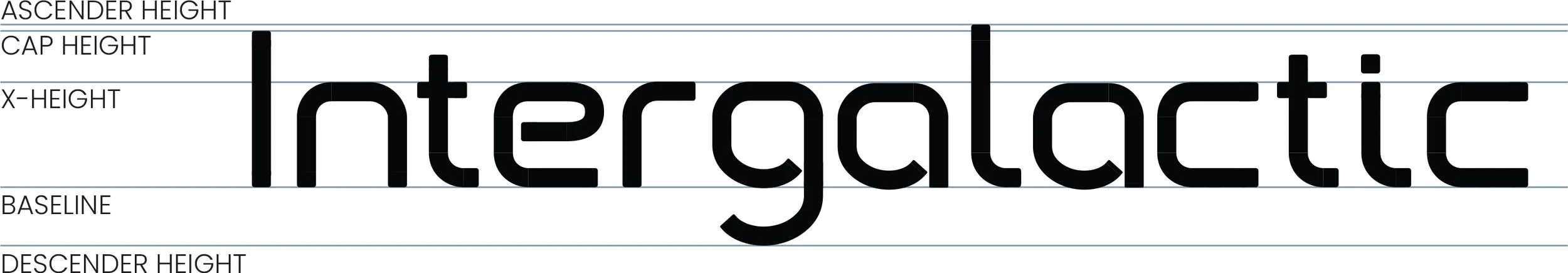
Sirius is a modern and clean sans serif typeface characterized by wide glyphs and uniform line widths. Despite a general form reminiscent of boxy shapes and straight lines, gently rounded terminals and corners give Sirius a softer contrasting appearance. The x-height and cap height are notable features due to the consistent, straight lines created by the glyphs, forgoing curved forms at the top of characters.
The width of the typeface makes it more suitable to short phrases and display text over body copy, offering a sleek and modern design that echoes the retro-futurism of the mid-20th century.
Sirius Type Anatomy Diagram
Type Specimen 1
Book Cover
Sirius is shown here in print, setting the visual tone for a book about the design of retro-futurism and the mid-20th century.
For this fictional book, I designed the cover using a grid of mid-20th century science fiction book covers. The background is a cream that helps unite the color palette (which includes the mosaic of book covers) into a warm cohesiveness. The angle of the title, slashing red banner, and white, all caps type creates a clear hierarchy for the title in a cover that could easily have been drowned out by the background noise.
Type Specimen: Book Cover
Type Specimen 2
Poster
In this example, the typeface is used in the title and subtitle for a digital or printed poster that is advertising for a fictional convention about the relationship of humanity and AI.
A combination of generative AI, illustration, and textures were used to design this poster.
Type Specimen: Poster
Type Specimen 3
Movie Title Cards
Sirius is used here as the typeface for movie title cards: the on-screen graphic that appears with the name of the film during the early parts of a movie.
For these mockups, I created some fictional movies and then used the typeface with stock photography to design these images of on-screen title cards.
Type Specimen: Movie Title Cards
Type Specimen 4
Branding
This mockup shows the typeface being used in branding as part of the branding identity of a fictional tech company called HelionIQ.
Generative AI was used to create the reception desk image which was then taken into photoshop to clean up artifacts, misshapen objects, and distorted perspective. The typeface was added in, modified for perspective, and then a glow effect was added.
Type Specimen: Branding
Type Specimen 5
Heads Up Display
Working with how the typeface complements sci-fi shape language, it’s used here for the text in a fictional video game HUD (Heads Up Display). Similar use cases could involve heads up displays or digital presentations in science fiction movies or television shows.
The HUD elements were made with a combination of illustration, generative AI, and stock images.