
San Diego Succulents
A project designing a fictitious website for a nursery in San Diego that focuses on providing local design services, maintenance, and its online shop.
Tools
Adobe Photoshop
Web Design
CASE STUDY
Design Problem
Design Challenge
To design some high-fidelity mockups for a website that would be presented to the client and then for the web development phase. This includes typography, colors, content, layout, etc.
Background
San Diego Succulents is a fictional company that offers design and landscaping services as well as a nursery where customers can purchase plants and landscaping products. It prides itself on its expertise in the microclimates of San Diego and knowing how to design and care for landscapes in the area.
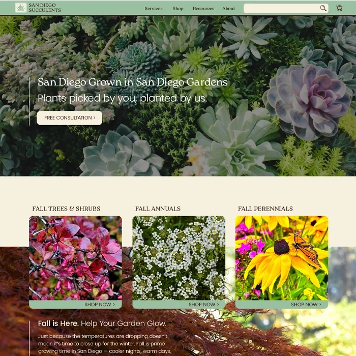
Homepage
Homepage
The design was created for a max width of 1440 px with the content centered at 1200 px. Responsive design would accommodate different screen sizes.
General design guidelines for the website include:
A palette of green, brown, and ivory.
Typefaces of Roca for headings and Poppins for all other content.
Rounded corners on boxes.
Thin horizontal lines to separate content when necessary and vertical lines to the left of text, particularly highlighted text or small paragraphs.
Homepage
Homepage Mockup
Shop
Product Listing Page
Hero images are used throughout the site with consistent typography of Roca for the page title and Poppins for the subtitle.
When different sections are selected in the navigation bar, the section is highlighted for navigation reference by turning the text into the ivory color and making the letters into all caps. A similar method is used in other cases in which buttons turn the text from brown to ivory to show they are selected as seen on the PLP page below highlighting the “Succulents & Cacti” page.
Product Listing Page
Product Information Page
Button language of green fill color and rounded corners show that it is interactable. Repeated CTA buttons to schedule a free consultation are located throughout the site to increase conversion of one of the primary focuses of the company.
Cross-selling carousels of other products are frequently used below primary content to increase purchase activity.
Product Information Page
Cart Page
The shopping cart icon is at the far right of the navigation bar, where most users expect to find it. The icon is of a cart with a succulent inside which is pulled from the company’s logo. When clicked and/or the user is taken to the “My Cart” page, the shopping cart icon turns from brown to ivory showing that’s where the user is located. A small number is also added to the icon showing the user how many items they’ve added to the cart to improve their experience.
The “My Cart” page shows the user what they currently have selected for purchase as well as the cost of the items and a breakdown of how an estimated total is calculated. The user also has the option to apply a promo code, adjust quantities, delete items, or favorite items for future purchase. All of this is to improve the user experience through online shopping standards and comfort for confident shopping.
Cart Page
Checkout Page
On the checkout page, the user is offered the ability to use an express checkout through one of the integrated online purchasing applications. Or they can purchase directly with credit card. This page shows a summary of their cart so they can continue with the purchase confidently knowing what they are buying.
A shipping form is available if the user chooses to continue with delivery. Prior to continuing to the payment page, there is an option to return to cart should the user want to adjust their purchase, again to improve the user experience.
Checkout Page
Mobile Design
Mobile Checkout Page
One of the primary adjustments of the mobile version is changing the layout to accommodate a smaller screen so that the information is still readable. Most of the content, including in the footer, is changed to reduce information from being displayed horizontally, so that information is instead formatted stacked vertically. This utilizes the scrolling function of a mobile device to contain large amounts of information. Where possible, some information is reduced into accordion dropdowns to clean up the design for the user and make the information only accessible if they wish to see it. The Order Summary dropdown below is an example.
In the navigation bar, the site logo drops the company name is replaced with only the company logo. All other information in the navigation bar is relocated under a clickable hamburger menu icon.